How to Use Stylistic Alternates in Photoshop
/Well crafted, Open Type fonts are so fun to work with. This week, the font, Goldenlife is available for free download. So I thought I’d help spread the word and show you how it, and other well-crafted fonts, make it easy to use OT features like Stylistic Alternates (which is a fancy name for additional versions of the same letter).
Here you can see how the type looks when applied using default settings (which I refer to as being “straight out of the box”) compared to the final version which has been hand typeset. (At least, as hand typeset as can be considering I used a computer. 🤣)

For this example, I’ve already added the basic form of the type, in this case, putting each word on its own layer.

Next, grab the Type tool (T) and click to insert your cursor, then click-drag to select or highlight an individual character, starting with the capital H at the beginning of Human. Because this is an Open Type font (.otf), it supports additional features beyond what True Type fonts (.ttf) are capable of. And, because the font was coded a particular way, you’ll see a little fly-out menu appear showing the alternative styles available for the highlighted character. So switching from the default H to a fancier version is as easy as mousing onto one of the other styles and clicking it.

I get giddy when I find fonts that are coded to include this fly-out feature. It makes things so much faster!
Continue to work your way through each word, one character at a time, experimenting to find the particular combination of styles that work best together. It’s a lot of trial and error, testing, tweaking, undoing, redoing, and eventually, finding a composition you’re happy with.
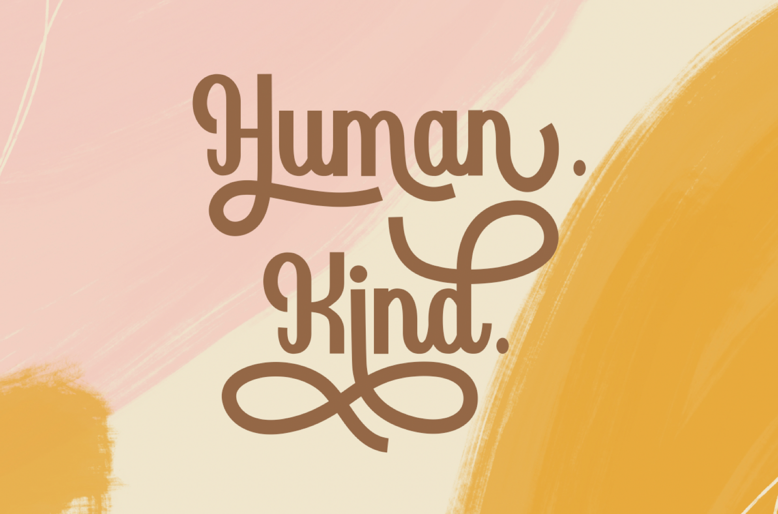
Now that are characters are individually styled, we can turn our attention to on small detail—the period after Human. Can you see what I see? The space between the n and the period in Human is not the same as the space between the d and the period at the end of Kind. Let’s fix that. Going back to the Human layer, click to insert your cursor between the n and the period. Then, with the cursor active, press cmd/ctrl and the left arrow on your keyboard a few times to tuck the period in closer to the n.

Better, right? Next I added the words “Be both” using the font, East Liberty Signature and a hairline stroke using the Rectangle Shape tool with the Fill set to None and the Stroke to match the text (#946746). For a final detail, I used the Custom Shape tool with the Fill set to #946746 and the Stroke set to None to draw out a small heart shape.

Ta-da! Don’t you feel fancy now?